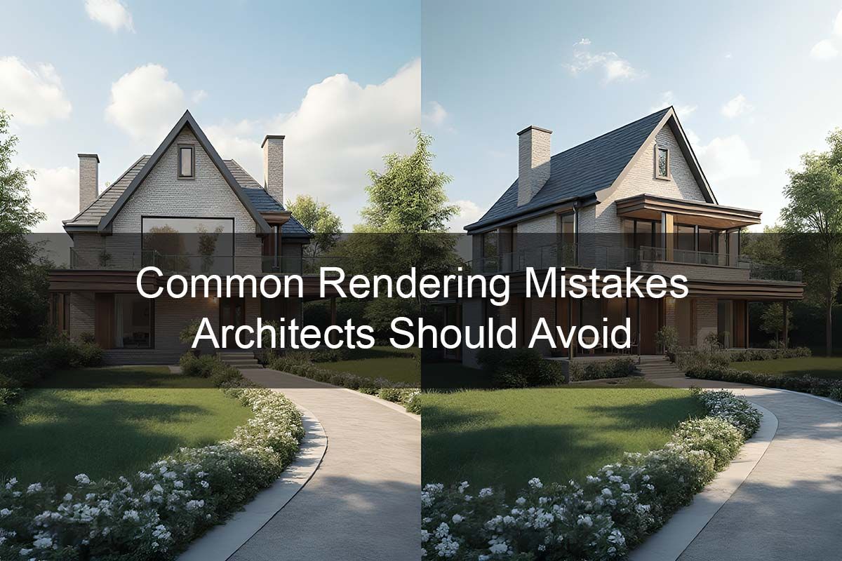
Common Rendering Mistakes Architects Should Avoid
Architectural renderings are powerful tools—when done right. But even the best designs can fall flat if the rendering doesn’t communicate the intent clearly or professionally. Clients, developers, city officials, and even your own team rely on renderings to visualize what doesn’t yet exist.
Unfortunately, many renderings miss the mark due to preventable mistakes. Whether you’re creating them in-house or outsourcing the work, recognizing and avoiding these common errors can elevate the effectiveness and impact of your visual presentations.
1. Inaccurate Lighting
Lighting can make or break a rendering. Too dark, and details disappear. Too bright or flat, and the image looks fake. The biggest mistake is ignoring real-world light behavior. Use natural daylight angles, balance artificial sources, and simulate realistic bounce lighting. Proper lighting gives depth, emotion, and a sense of time.
2. Unrealistic Materials or Textures
Low-resolution or overly shiny materials ruin the believability of a space. Walls that reflect like mirrors, wood that looks plastic, or flooring with repeated texture seams all scream ‘fake.’ Use high-quality textures, correct UV mapping, and reference real-life samples to keep things grounded.
3. Missing Context
Floating buildings with no landscape, background, or surrounding structures leave viewers confused. Every architectural rendering needs environmental context to help viewers understand placement and scale.
4. Over-Rendering
While photorealism is the goal, going too far can make the image feel artificial or overly staged. Over-saturated colors, too many lens effects, or unrealistic reflections can distract from the design.
5. Poor Composition
The camera angle should showcase the most important features of the space—not awkward corners or distorted wide-angle shots. Use rule of thirds, vanishing points, and focal hierarchy to guide the eye effectively.
6. Lack of Human Scale
Renderings that don’t include people, furniture, or everyday objects can feel sterile and hard to relate to. Viewers need familiar reference points to mentally inhabit the space.
7. Ignoring the Client's Brand or Story
A rendering is not just a picture—it’s a message. If your client has a distinctive style, mission, or target audience, the visuals should reflect that. The mood, colors, and composition should align with the brand identity.
8. Technical Inaccuracy
From incorrect dimensions to impossible lighting scenarios, technical mistakes undermine your credibility. Double-check geometry, verify camera height, and use correct lens perspectives.
How 3DAStudio™ Avoids These Pitfalls
At 3DAStudio™, we combine artistic sensibility with architectural accuracy. Our CAHD™ process (Computer Aided Human Designed) allows our artists to focus on creative decisions while leveraging AI tools for consistency and efficiency.
Every rendering we produce goes through a review checklist: lighting, texture mapping, storytelling, and real-world plausibility are all carefully scrutinized. We collaborate with architects and developers to ensure alignment with their design goals and presentation needs.
Conclusion: Great Design Deserves Great Rendering
Avoiding common rendering mistakes isn’t about perfection—it’s about clarity, consistency, and professionalism. A great design poorly rendered can cost you approvals, sales, or client confidence.
Let 3DAStudio™ help you get the visuals right from the start. Contact us today to elevate your renderings and avoid the pitfalls that could derail your project.
More From "The Complete Guide to Architectural Rendering for Architects and Developers"
- The Complete Guide to Architectural Rendering (Main Page)
- Why Architectural Rendering is Essential
- How 3D Floor Plans Help Architects
- Top Benefits of Photorealistic Rendering
- The Role of Architectural Rendering in Project Approvals
- Using 3D Rendering for Marketing and Pre-Sales
- Interior Rendering Techniques That Impress
- Common Rendering Mistakes Architects Should Avoid
- What Makes a Rendering Studio Stand Out
- How Developers Use 3D Massing Models
- CAHD™ in Architectural Rendering: A Human-Centered Use of AI

