Color Theory in Interior Design | 3DAStudio United States
Color Theory in Interior Design
How Color Impacts Space, Mood, and Design in 3D Visualization
Have you ever been struck by the harmony of a beautifully composed interior rendering—or walked into a real-world space and immediately felt at ease without knowing why? In most cases, that reaction stems from intentional choices rooted in color theory.
Great interior design is more than arranging furniture or selecting stylish finishes. It’s about understanding the science of space, function, and atmosphere—and color is one of the most powerful tools in that process. For architects, designers, and 3D visualization professionals, mastering color theory is essential when creating compelling and emotionally resonant interiors.
In this article, we explore how color theory plays a foundational role in interior design and how it influences the way we approach visualization in rendering and virtual staging.
What Is Interior Design?
Interior design is the art and science of enhancing interior environments to support better functionality, aesthetics, and comfort. It applies to residential, commercial, public, and institutional spaces and aims to shape how we interact with and feel within a space.
In today’s workflows, 3D interior rendering plays a central role in presenting and developing design concepts. Whether through hand-drawn renderings or advanced rendering software, designers and 3D artists use visual tools to simulate how a space will look and feel before it's built.
At 3DAStudio™, we use interior renderings not just to illustrate ideas, but to communicate layout, materials, lighting—and most critically—color choices that bring the entire design together.
Why Color Matters in Interior Design
Color has an immediate psychological effect. It influences mood, shapes perception, and drives decision-making. In marketing, in architecture, and especially in interior design, color becomes a silent language—guiding users through a space, setting emotional tones, and enhancing spatial experience.
Color theory helps designers understand not only which colors work together but why they affect us the way they do. A thoughtfully chosen color palette can make a small room feel spacious, give a neutral space warmth, or add energy to an otherwise reserved layout.
What Is Color Theory?
Color theory is the system by which we understand, organize, and combine colors. It draws on principles from physics, art, and psychology to explain how we perceive color and how different combinations create harmony or contrast.
At the heart of color theory is the color wheel, a visual tool that displays the full spectrum of hues and helps designers select complementary, monochromatic, or analogous color schemes. In professional practice, designers often rely on color wheels, manufacturer fan decks, or digital color palettes to guide their decisions.
Color theory also considers color temperature—the idea that colors can feel “warm” (reds, oranges, yellows) or “cool” (blues, greens, purples), and that the temperature of a color can affect the emotional tone of a room.
Common Color Schemes in Interior Design
Let’s explore three foundational color schemes and how they’re used in interior rendering and design.
Complementary Color Scheme
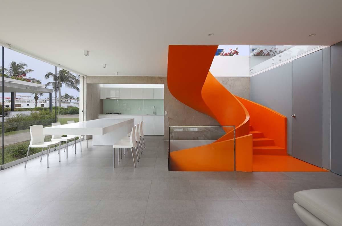
Complementary colors are opposite one another on the color wheel. When used together, they create high contrast and vibrant visual interest. In interior design, complementary schemes are often used in moderation—one bold accent color paired with a neutral or muted dominant tone to provide balance.
This scheme is particularly effective in modern or minimalist interiors where a limited palette is enhanced by a striking pop of color—such as teal accents in a white kitchen or orange upholstery in a gray office.
Monochromatic Color Scheme
A monochromatic scheme uses variations of a single color. This includes lighter and darker shades, tints, and tones of one base hue. The result is often a soothing, cohesive interior that feels calm and well-organized.
Monochromatic schemes are popular in healthcare, hospitality, and residential design where a unified look is desired. In rendering, this approach allows textures and materials to take center stage while maintaining a consistent visual flow.
Analogous Color Scheme
Analogous colors sit side by side on the color wheel. These schemes use three (or more) neighboring hues, offering a more varied but still harmonious palette.
Analogous color schemes are ideal for creating spaces with more depth than a monochromatic approach while still avoiding the stark contrast of complementary pairings. In practice, two of the hues might be dominant, with a third used for accents such as pillows, wall art, or lighting.
Applying Color Theory in 3D Interior Rendering
For those working in 3D rendering and visualization, understanding color theory is vital when crafting realistic, market-ready imagery. Renderings that apply accurate color theory not only look more lifelike, but they also evoke emotion, communicate purpose, and help clients connect with a space on a deeper level.
When rendering interiors, color theory impacts choices such as:
-
Paint and finish selections
-
Material combinations (wood tones, metals, upholstery)
-
Lighting temperatures (warm white vs. daylight balance)
-
Shadow and highlight contrast
-
Styling of art, furniture, and accessories
The best visualizations subtly incorporate color theory to create balance, rhythm, and focal points within the scene. At 3DAStudio™, we use both artistic insight and psychological understanding of color to produce renderings that not only look beautiful but resonate with viewers.
Final Thoughts
Color theory is not just a technical tool—it’s a creative language that allows designers to tell a story through space. When used effectively, it brings together mood, form, and function in a way that feels intentional and immersive.
For interior designers, architects, and 3D rendering professionals, applying color theory elevates both the aesthetic quality and communicative power of your designs.
Whether you’re rendering a luxury apartment, a boutique hotel, or a healthcare environment, the right use of color can transform the perception of your space and deliver greater impact for clients and users alike.
If you’re ready to bring your interior vision to life with stunning, color-savvy renderings, 3DAStudio™ is here to help. Let’s create something memorable.

